Since messing around with the boardgame dataset from last time, I have since discovered that its original purpose was to train a computer to predict how highly users would rate each game. Knowing that, and also having recently learned how to train a computer to look at datasets such as this and make predictions from it, I decided to try my hand at using the data for its original purpose.
Now, it is actually fairly easy to get a machine to make predictions like this that are reasonably accurate. Even if you have no idea what you’re doing, if you can figure out how to code, you can have one of these models up and running pretty quickly. Much more difficult is figuring out HOW the computer model is making those predictions. There are whole libraries in various computer languages dedicated exclusively to visually expressing what the computer is doing when it says “X boardgame will have an average rating of Y.” Picking the correct visualization is key to understanding what a model is doing and picking the wrong one can be disastrous to your understanding of the data.
So today I’m going to take you through my journey of accidentally blinding myself to a problem because of the visualizations I chose. You will see these visualizations lead me to wrong conclusions, that I then justify to myself, which will then lead to more wrong visualiaztions which will lead me to more wrong and eventually contradictory conclusions, until (finally!) I try a different, more basic graph, and realize what I’ve been doing wrong the whole time.
To reiterate, I will do all of this bad thinking while still having a model that makes pretty accurate predictions. I cannot stress this enough, for most of my time working with this dataset I had the completely wrong idea about what the data meant, its implications on the real world, and I was still using the computer to predict the average rating of a given board game to a pretty reliable degree.
So, that said, are you ready to begin?
To start figuring out what my model was doing with the data I was feeding it, I looked at what is called a permutation matrix (first mistake, I started out too complex). This is essentially a measure of how important each feature of the data is to the computer’s predictions. The higher the number on a column, the more sway that column has over the computer’s predictions.
Now, if you had a boardgame that a bunch of internet user’s rated on a scale of 1 to 10, which of the following things about the game do you think would be most important to know when guessing how high the average user rating of a game would be: the year the game was made, the minimum numbers of players, the max number of players, how long the game takes, the minimum recommended age, the total number of people who rated the game, the total number of owners of the game, the total number of people who want to buy the game, or how complex the game is?
Answer (according to this BAD visualization):
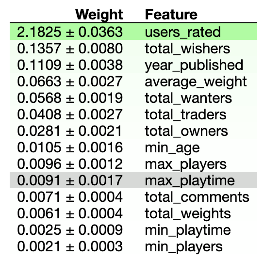
According to this table, what you want to base your guess on is just the total number of people who rated the game. By a country mile that is most the important column to look at. The score of the next closest column is about 1/20th as high. Nothing else even comes close to being as important as the number of ratings a game gets.
Now ask yourself why that makes sense. Because that’s what I did, and this is what I came up with:
“The number of people who rated a game probably correlates to how many people own the game and therefore can be used as a measure of how popular it is, and if a game is popular (outside of the hopefully dying exceptions of Risk and Monopoly, man are those games terribly designed) it’s probably good, and therefore will probably have a high rating. It’s not often that a lot of people both own something and detest it at the same time after all.”
And here’s when we can see the problems with my logic already beginning to arise. Take a look at the data we have access to. We already knew how many people owned the game! That was data the computer had, and the computer decided to ignore it! Looking back at the table, it’s not even in the top 5! It’s 7th out of 14!
That was my justification for that table I just showed you. My thinking was long, convoluted, and made a bunch of assumptions that I had no data to back. Bad, bad, bad practise all around.
And I never questioned this! I saw that table and thought, “Huh, that’s weird, how cool!” I had my explanation and was happy with that. Especially because it confirmed a few of my own biases. The main one here is I don’t like rating systems. This will become relevant later.
Now take a look at this:
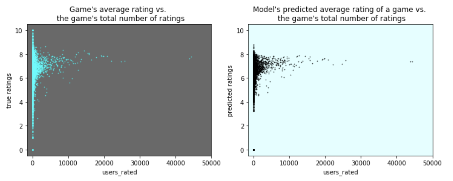
On the left is the actual board game rating averages plotted against how many people rated the game, on the right is our model’s prediction of the average rating based on all the data I gave it. Also note that this is a scatter plot, that will also become relevent a little later.
Just looking at this graph, our model looks pretty good (which is NOT necessarily an indicator you are doing things right)! Just giving it a glance over shows it does a pretty good job at predicting a game’s average rating. There are a couple of visible flaws but overall it looks pretty good. And here’s where my bias comes in.
I don’t like ratings systems. The idea of “I am going to quanitify all possible variables and measures of fun and enjoyment and quality down into one number for an entire field of products and rank them in order down to the very last,” just seems silly, impossible, and completely disregards how we humans have different taste in games and in all things generally. What I especially don’t like is that for some reason we’ve decided that ‘7’ is average on scales from 1 to 10. It drives me nuts it isn’t ‘5.’ When someone says, “It’s alright I guess, I’ll give it a 7,” I feel that internet compulsion to tell them they’re wrong. I ignore it (usually) but still I hate it!
So given that little human nudge towards ‘7’ being the default average, wouldn’t you know, the average rating as the number of humans who rated a game increases tends to approach, you guessed it, (well, I guess you wouldn’t technically be guessing at this point, you know, since you… saw it… because I showed you) a ‘7’! Hooray, bias confirmed! So humans are weird, and therefore the data is weird too because of some connection back to human brains and how they rank things being bad and not helpful. HA HA I AM SO RIGHT ABOUT THIS!!!
Except this is all bogus (well all except the part where there is no objective ranking). I mean, so what if the average goes to ‘7’? That is what a large data set of averages is mathematically always going to do! By the Central Limit Theorem we expect a group of averages to approach a normal distrubution eventually, and, even though this isn’t a histogram what we roughly see here is a normal distribution.
This isn’t a result based on how humans behave, it’s a natural outcome of the way math works.
So the Central Limit Theorem along with human’s liking ‘7’ mostly explains the averaging to ‘7’ as the number of ratings increases, but what about that first table? Why is the model so obsessed with looking at the number of ratings to determine what its prediction is going to be? The answer is in the histogram, the most basic of plots, and is the plot I should have started with.
So here she is. I give you the rock that shattered my glass castle: the humble histogram:
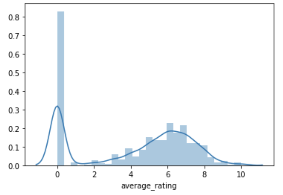
All this is doing is counting the total number of each unique average ratings. Look at how many games have an average rating of 0.
Now look at this next histogram:
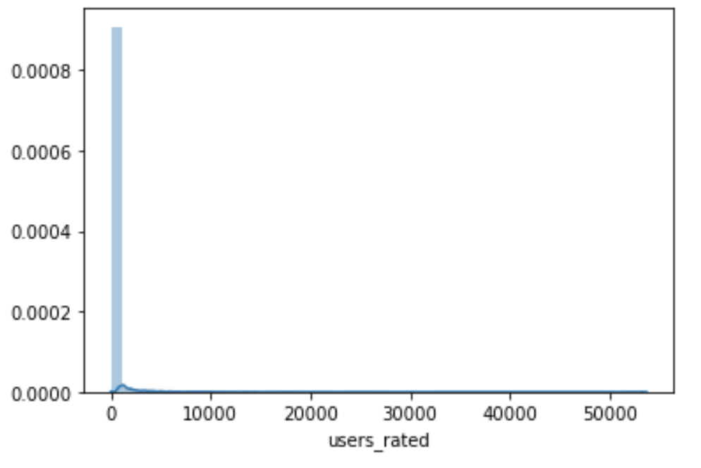
Look at how many games have 0 ratings (technically this one shows all values close to zero, but the zeroes are the majority of that huge blue bar you see there).
So the most common average rating is 0, and the most common number of raters is 0.
Going into this in a more exact fashion we see that the total number of games with a 0 average rating is 24361. We then count up the number of games with no ratings at all how many do we find? Also 24361.
Well isn’t that suspicious! Why are these numbers EXACTLY the same? Because the average rating of a game that has no ratings at all defaults to 0!
That’s 24361 games out of a dataset that, when we delete repeated games, has a total of 79463 games logged in it. That’s 30% of all the games in the dataset that have this property.
Well if there are 24361 of these things, where are they on the scatter plot, you might ask? Layered over the top of eachother at the origin, because that is how scatter plots work. Scatter plots show spread, not count! In this case 30% of our data (when looking at users rated vs. average rating) is at exactly (0, 0) and so the scatter plot puts almost a third of data at that one point in the plot.
And take a closer look at those scatter plots. Did you notice the computer’s distate for making extreme predictions? The plot on the right doesn’t reach as far up or down as the plot of the true game averages on the left. The computer tends to place predictions in areas where it has a lot of data, and you can see that. The tails are shrunk, but that healthy populated mid section in both is full of points.
EXCEPT, despite removing all of the most extreme points, one such place still remains in the computer’s predictions: the point at (0, 0). And that is because it is almost as well populated with information as that huge clump around ‘7’ is!
Given all of this, then it’s no question as to why the number of ratings is weighted so heavily in the model! Based off of that one fact alone it can get a third of its predictions exactly right. Check the number of ratings for a ‘0’, if so, give the game in question an average rating of ‘0’. This isn’t helpful machine learning insight. This is just how math works. All this fancy machine learning is doing is declaring that zero is indeed zero. Great, thanks, wonderful work.
So, what happens when we remove all of those obvious zeroes from the dataset and train the model on what’s left? Which column will the model most highly value now? Here’s what the new permutation matrix looks like:
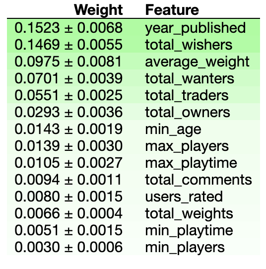
Which makes so much more sense. A game’s age is a big factor, newer games and really old successful games are probably rated higher, the new because they’re fresh, the old because they’re tried and tested. The number of people who want a game is a big factor in how highly it’s rated, how many people who own the game is decently useful in figuring out how highly it’s rated, etc. With the zeroes removed we can actually see trends in the data, we have insight now into what’s actually important when predicting how much people like a game.
We aren’t just calling a zero zero.